2. Why Wall Colours Matter in Modern Home Design
Wall colours are more than just a backdrop—they’re the emotional heartbeat of your home. Ever walked into a room and felt instantly calm or inexplicably agitated? That’s the power of colour. It impacts mood, perception of space, and even our day-to-day productivity. In modern home interiors, where open layouts and minimalism often take center stage, your wall colours play a starring role in tying together aesthetics and function.
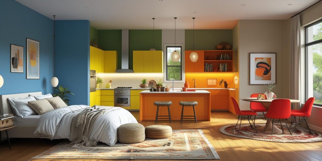
Psychological Effects of Colour in Interior Spaces
Colors influence how we feel.
Blue promotes calm—ideal for bedrooms and study rooms.
Yellow and orange spark energy—great for kitchens and creative spaces.
Green symbolizes balance and freshness, perfect for creating peaceful corners.
Red is bold and energizing, best used thoughtfully in dining or living rooms.
Designers use colour psychology to create spaces that not only look good but feel right.
The Role of Wall Colours in Home Aesthetics
Wall colours affect how we perceive space.
Lighter shades (whites, creams, pastels) make rooms feel larger and airier.
Darker tones (like navy or charcoal) add coziness and depth.
Matching wall colors with flooring, furniture, and décor ensures a unified, stylish interior. Whether your style is minimal, modern, or eclectic, the right color choices tie everything together beautifully.
3. How to Choose the Right Colour Combinations
Wall colours affect mood, space, and flow. Don’t pick shades on impulse—plan with purpose.
Basics of Colour Theory
Complementary: Opposites (e.g., blue & orange)
Analogous: Side-by-side hues (e.g., blue, teal, green)
Triadic: Equally spaced (e.g., red, yellow, blue)
Use these to create harmony, not clashes.
Consider Light & Purpose
Natural light shows true colours.
Use soft blues or greens for calm, yellows or oranges for energy.
Lighter colours open up space, darker ones create coziness.
Always test a sample on your wall first.
4. Trendy Yet Timeless: 2025 Wall Colour Combos
Earthy Neutrals + Deep Green
Grey, taupe, and forest green offer a grounded, modern look. Best with wood accents.
Blush Pink + Charcoal Grey
Soft yet bold—perfect for bedrooms or home offices with metallic accents.
Midnight Blue + Burnt Orange
Dramatic and artistic. Great for living rooms and accent walls with rich textures.
5. Unique Two-Colour Wall Ideas
Half-and-Half Walls
Top in light tones, bottom in dark tones (e.g., beige + navy) for contrast and height.
Color Blocking
Vertical blocks add height; horizontal ones add width. Try mustard + olive green.
Complementary Accent Walls
Use opposite colours on adjacent walls (like teal + rust) for energy and contrast.
6. Wall Colour Combos for Every Room
Living Room
Beige + teal = cozy & elegant
Grey + mustard = modern warmth
Off-white + olive = minimal chic
Bedroom
Lavender + dove grey = calming
Navy + blush = cozy romance
Terracotta + ivory = earthy and warm
Kitchen/Dining
Sage + white = fresh & airy
Black + copper = bold and rich
Pale yellow + warm grey = casual and inviting
7. Paint Finishes & Textures
Finish Types
Matte: Smooth, hides flaws, best for low-traffic rooms
Glossy: Reflective, easy to clean, ideal for kitchens/bathrooms
Eggshell: Balanced sheen, suits most rooms
Textures for Depth
Sponging, rag rolling, or metallic glazes add drama
Venetian plaster = high-end, marble-like finish
Textures change how light interacts with color, adding interest
8. Cultural and Regional Influences on Colour Choices
Wall colors often reflect local culture and climate.
Scandinavian Minimalism uses whites, soft greys, and pastels to brighten dark winters—perfect with light wood and clean lines.
Mediterranean Warmth embraces earthy tones like terracotta, ochre, and sea blues. These colours reflect sunny coastlines and work well with rustic textures and tiles.
Incorporating regional colors adds personality and depth to your interiors.
9. Common Mistakes to Avoid with Wall Colour Pairings
Too Many Dark Shades
Dark colors can overwhelm. Use them sparingly—like on an accent wall—and balance with lighter tones.
Ignoring Existing Elements
Wall colors must match your furniture, flooring, and decor. Always create a mood board to test how everything fits together before painting.
10. Expert Tips for DIY Colour Experimentation
Always Sample First
Paint test patches on multiple walls. Light changes how a color looks throughout the day.
Use Colour Visualizer Apps
Apps like Dulux Visualizer or Sherwin-Williams ColorSnap let you preview colors on your own walls digitally. Great starting point—just confirm with a real paint sample.
11. Sustainable and Eco-Friendly Paint Options
Go for Low-VOC or Zero-VOC Paints
They reduce toxic fumes and are safer for homes with kids and pets. Look for certified eco-labels.
Try Natural Paints
Made from clay or plant oils, these offer rustic tones with minimal chemicals. Pair with eco-friendly tools for a fully green makeover.
12. Budget-Friendly Wall Makeover Ideas
Accent Wall – Paint one bold wall for big impact.
Painter’s Tape Designs – Create stripes or shapes affordably.
Use Leftover Paint – Try small projects like trim or murals.
Stencils/Wall Decals – Easy DIY style upgrades.
Upcycled Decor – Coordinate wall colours with thrifted finds for a polished look.
13. Conclusion - Wall Colour Combinations
Choosing unique wall color combinations isn’t just about looks—it shapes mood, functionality, and even home value. From balancing bold and neutral tones to considering lighting, room purpose, and cultural influences, every choice matters.
Whether you prefer soft Scandinavian pastels or warm Mediterranean hues, your colors reflect your style. Test shades, observe them in natural light, and don’t shy away from bold statements.
Today, wall painting is a powerful design tool. So pick your palette, experiment smartly, and let your walls express your personality with modern flair.
14. FAQ's - Wall Colour Combinations
a) What are the best wall colours for small rooms?
Lighter colors like soft whites, pale greys, and pastels are ideal for small rooms. They reflect more light, making the space feel bigger and more open. Consider adding an accent wall in a medium tone for depth without overpowering the space.
b) Can I mix cool and warm tones together?
Absolutely! Mixing warm and cool tones can create a balanced and visually appealing room. Just make sure one tone dominates while the other complements. For example, pair a cool navy wall with warm tan accents through furniture or decor.
c) How often should I repaint my walls?
Interior walls should typically be repainted every 5–7 years, depending on wear, tear, and lifestyle. High-traffic areas like kitchens and hallways may need more frequent touch-ups, while bedrooms can go longer without repainting.
d) Are there mobile apps to preview wall colours?
Yes, several mobile apps like Dulux Visualizer, Sherwin-Williams ColorSnap, and Benjamin Moore Color Portfolio allow you to upload photos of your room and test wall colour combinations digitally before painting.
e) Which wall color combinations are trending in 2025?
In 2025, popular combos include:
- Earthy neutrals with deep green
- Blush pink with charcoal grey
- Midnight blue with burnt orange
- Soft lavender with dove grey
- Terracotta with warm ivory
These pairings reflect a balance of nature, serenity, and bold personal style.